Project Description
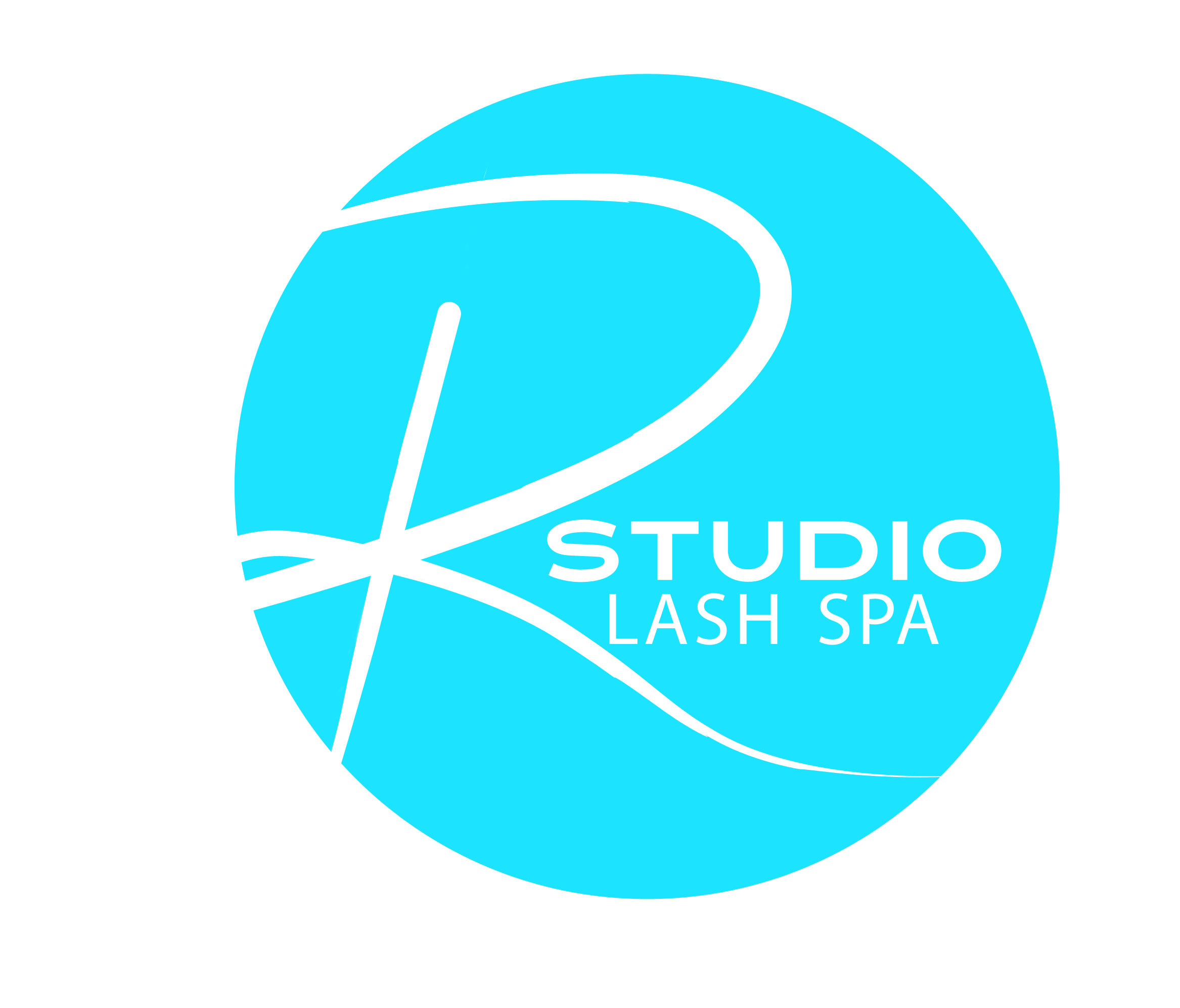
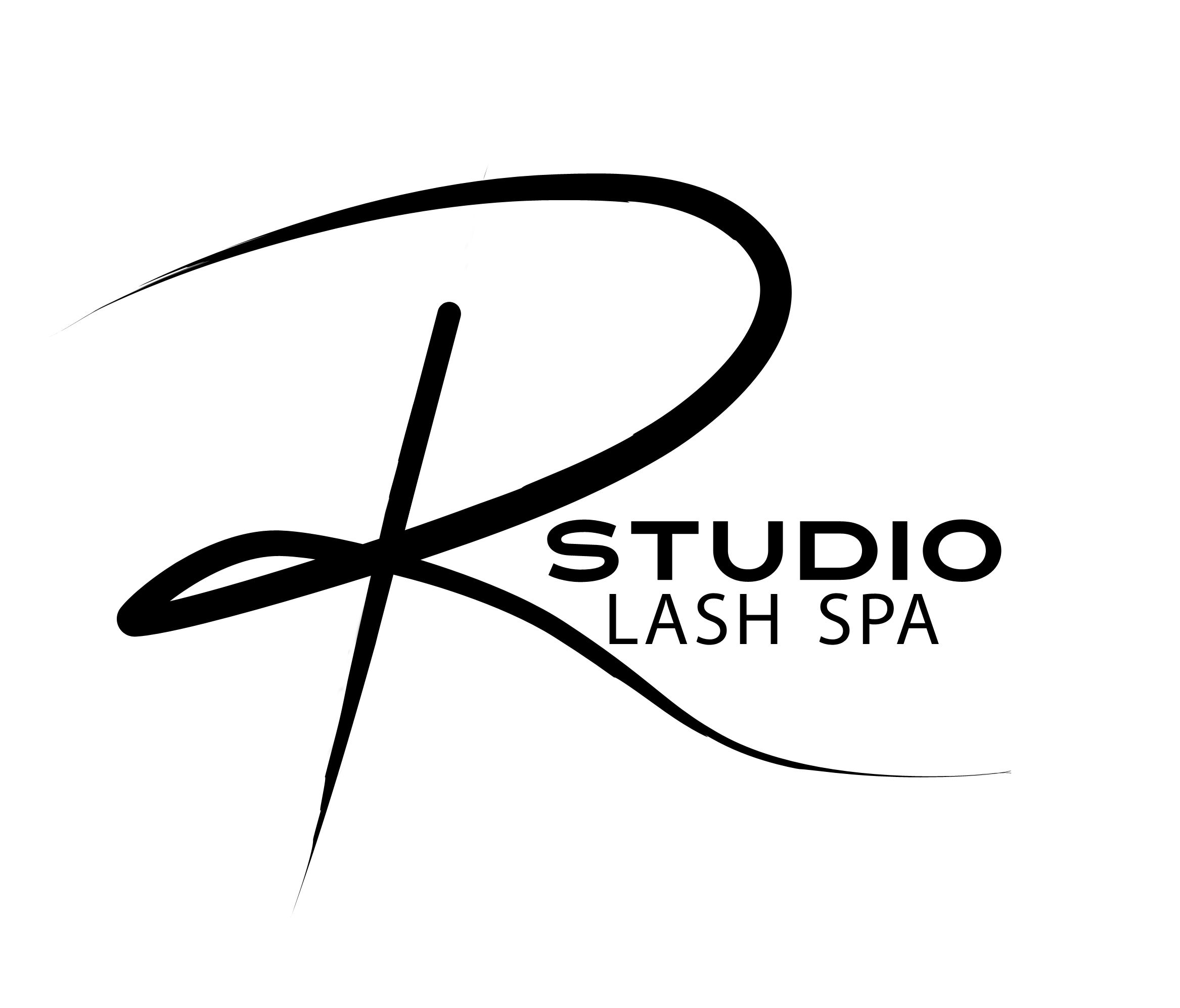
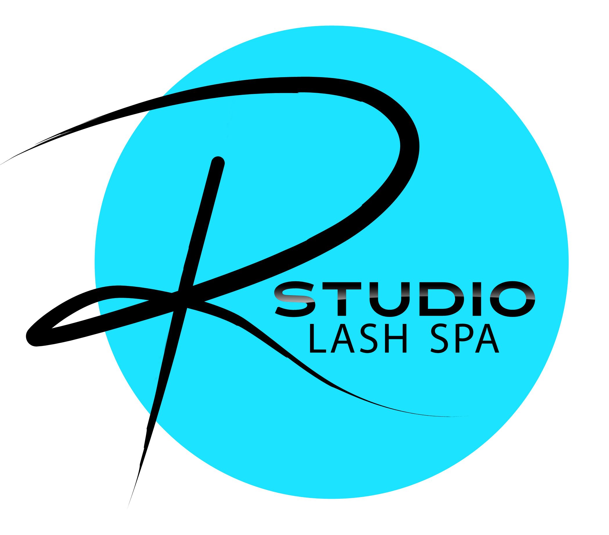
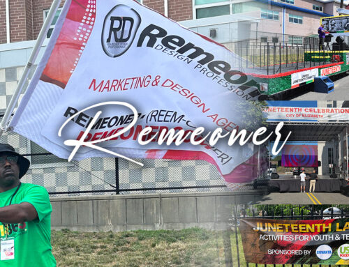
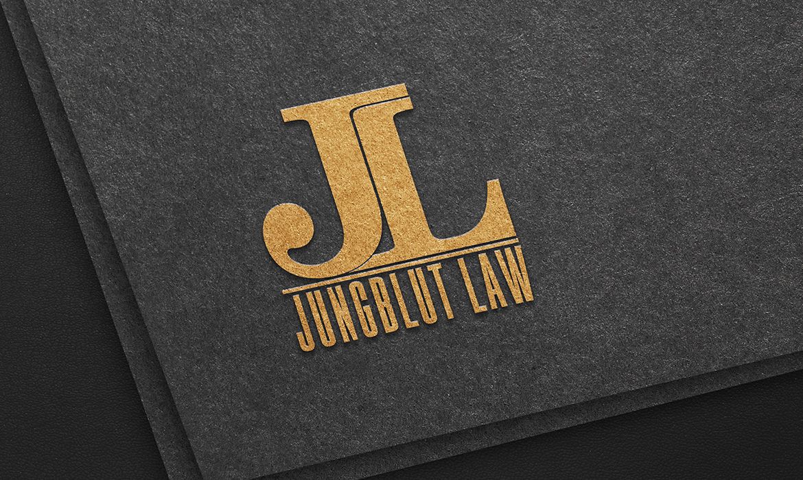
R Studio Lash Spa, now R Studio Beauty, is a client that I worked with between 2013-2014. At the time, Regina and her husband were leasing a space in Westfield, NJ that was not even built out. They walked me through the space, describing their vision and dreams for the future while also providing context in relation to Regina’s past experiences. The result was a beautifully crafted logo design that reflected the essence of R Studio Lash Spa. What makes this logo design so unique is that the R in the logo is hand-drawn. I used a Wacom tablet and wrote the R repeatedly until it felt right. The logo has since evolved as R Studio Lash Spa became R Studio Beauty, and their brand grew to include a second location in Florida. However, the original R still stands, and there is no disconnect between the old and the new. This design has stood the test of time and continues to represent the essence of R Studio Beauty’s brand.
What started as a small business idea has grown into a thriving beauty studio with a unique brand identity. R Studio Beauty has been able to maintain its roots while expanding its reach to a new location. The logo remains a crucial element of the brand’s identity, serving as a reminder of its humble beginnings and its commitment to quality and creativity. Remeoner’s dedication to creating a logo that truly reflected R Studio Lash Spa’s vision and values has undoubtedly contributed to the company’s success. As R Studio Beauty continues to grow and evolve, it is reassuring to know that the logo remains an integral part of its identity. At Remeoner, we understand the importance of crafting a unique brand identity that stands the test of time. Contact us today to start your branding journey.